
Building a brand for the boring-but-essential,
digital receipts, done right.
Background
Every year, millions of paper receipts get shoved into wallets, glove boxes, and drawers until the one time you actually need one—and it’s gone. Faded thermal ink, a lost warranty claim, a tax-season scramble.
Dockit set out to fix that: a digital receipt and warranty management platform for the Australian market, letting people capture, store, and act on every purchase record in one place.
Maddison, the founder, came to Everest Engineering with a working product vision but no visual identity. My job was to give Dockit a brand that felt trustworthy enough to hold someone’s financial paper trail, but light enough that saving a receipt didn’t feel like a chore.
Problem Statement
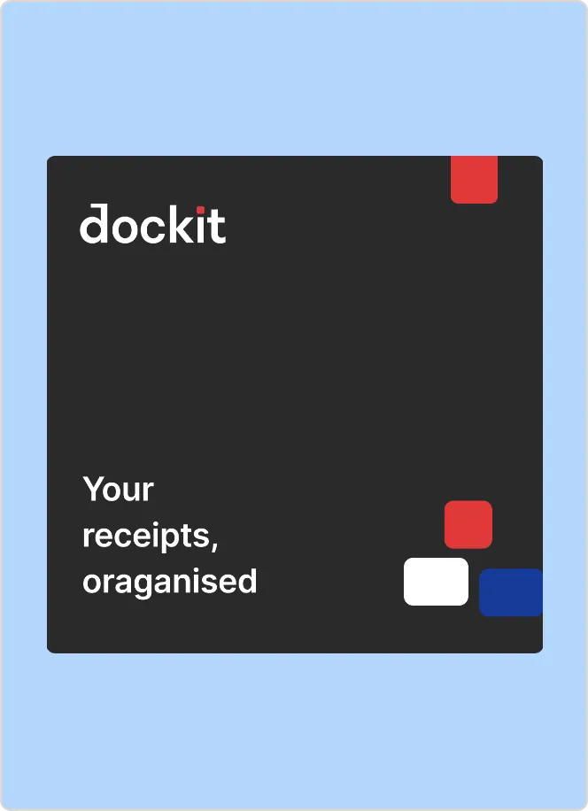
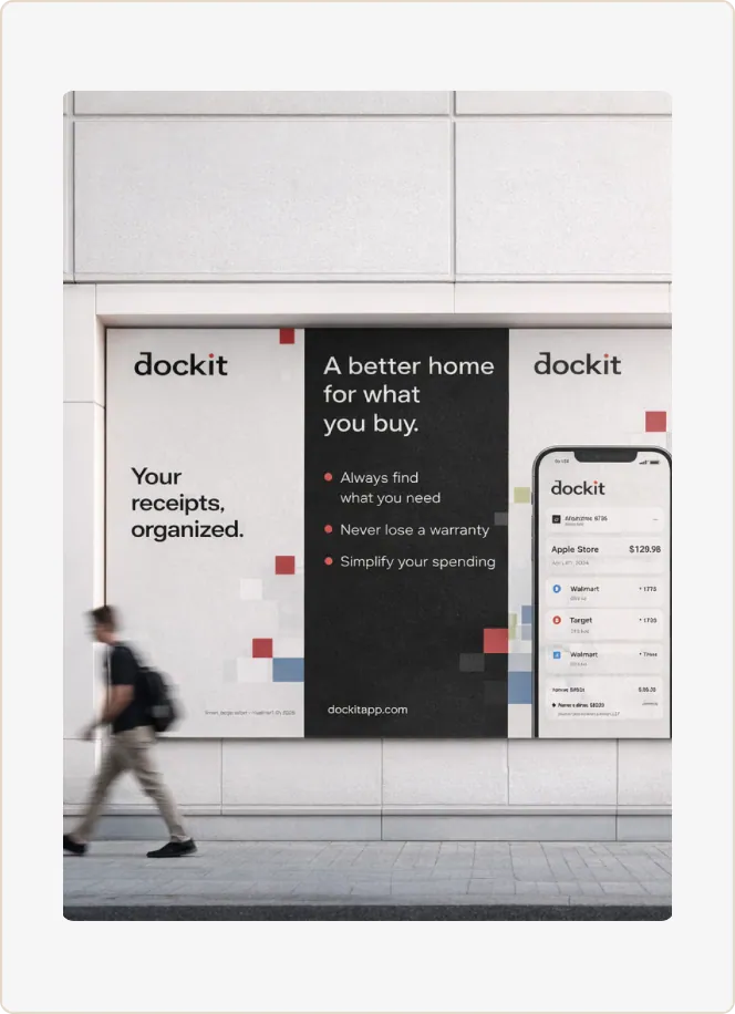
Receipt and warranty management sits in an odd emotional space. It’s utility software nobody opens it for fun but it touches money, ownership, and proof. Make the brand too corporate and it feels like accounting software. Make it too playful and it undermines the “this is a legal document” trust the product needs.
The brand also had to work across a genuinely wide surface area: a consumer mobile app for everyday shoppers, a merchant admin console for retailers issuing receipts, a marketing site selling the vision to both sides, and app-store listings competing for a two-second glance. One identity, four very different jobs.
The Process
I started by mapping the emotional job of each surface rather than designing screens first: the consumer app needed to feel calm and quick (capture and forget), the merchant console needed to feel operational and precise (this is their business tooling), and the marketing site needed to sell trust and simplicity to two different buyers at once.
From there, the brand identity took shape around a few deliberate choices:
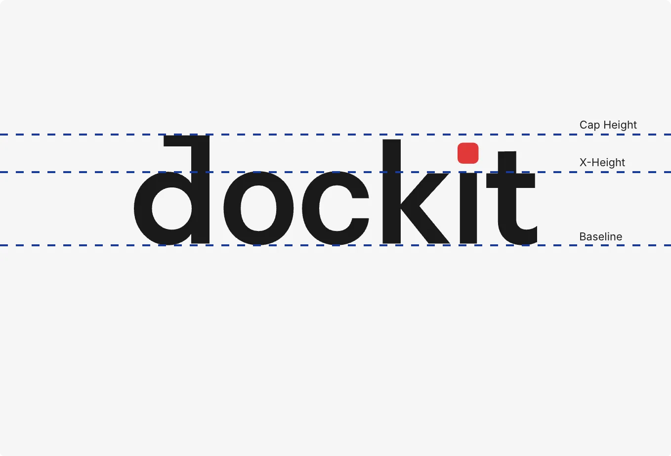
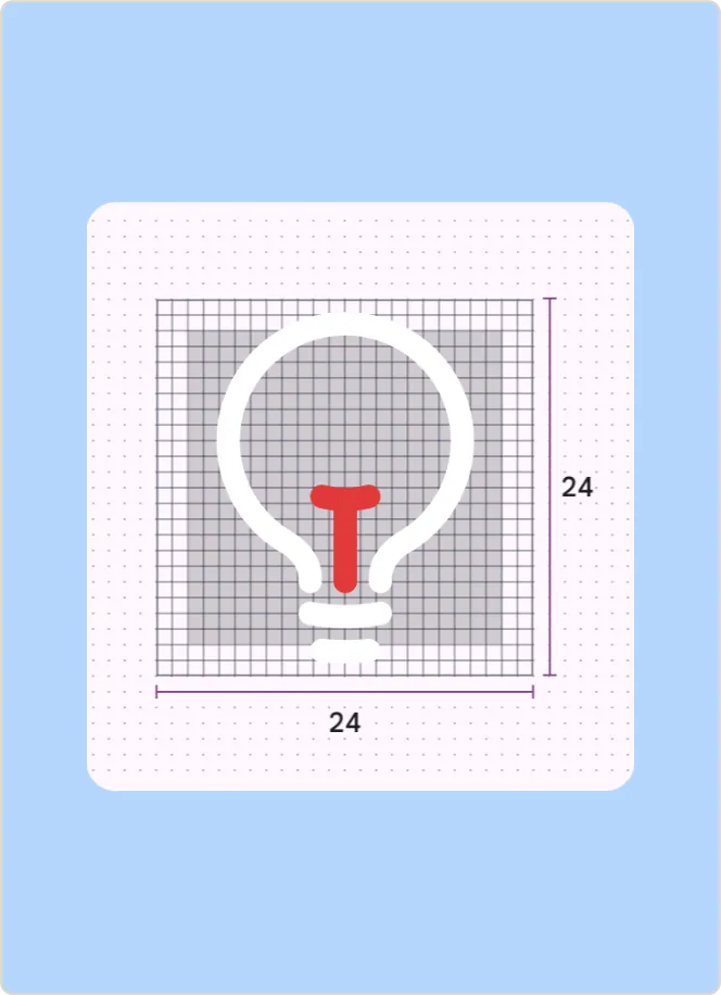
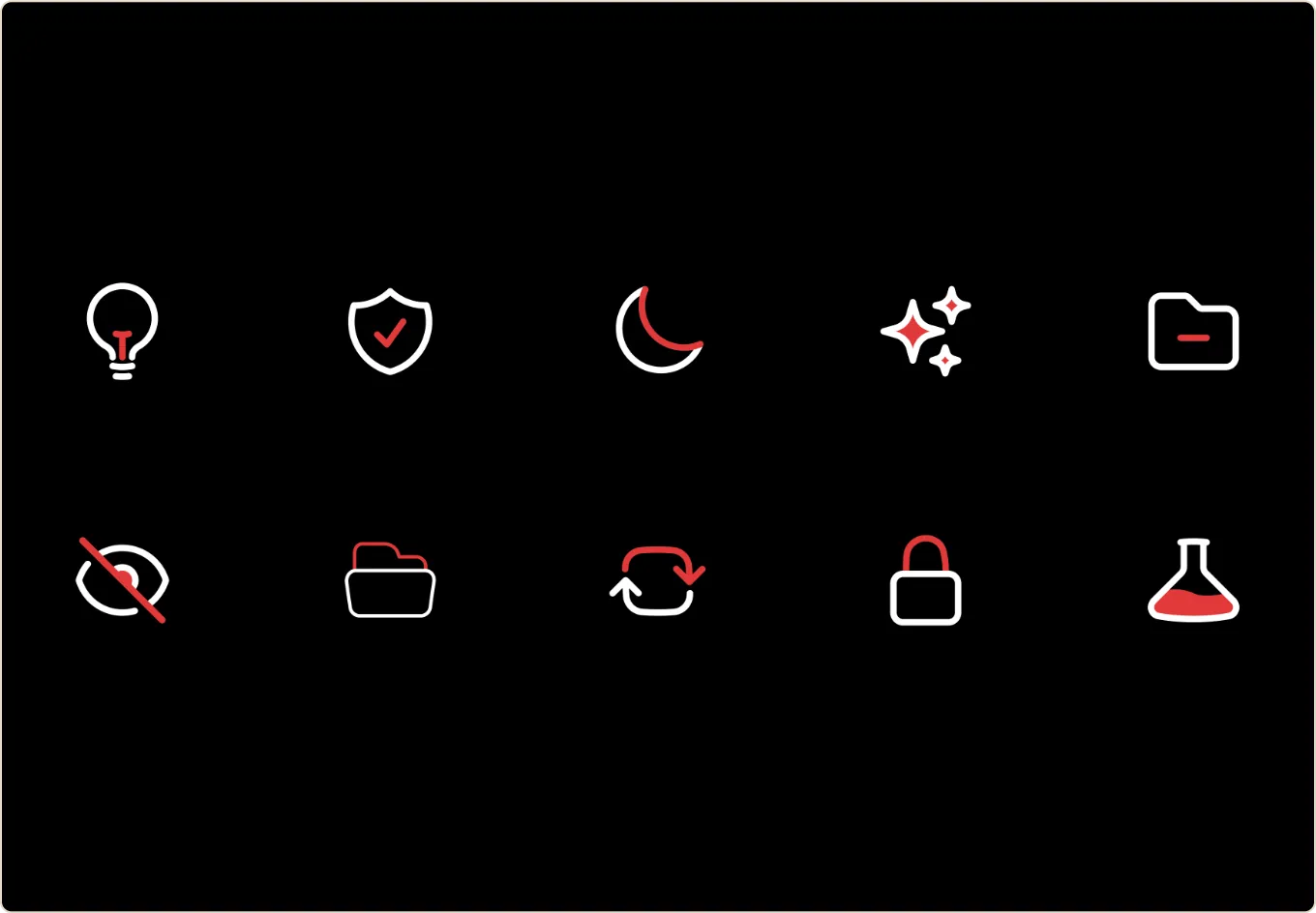
- A mark that reads as “proof,” not “paper.” Rather than leaning on the obvious receipt or paper-scroll cliché, the logo needed to suggest safekeeping and verification something closer to a stamp of record than a stack of documents.
- A restrained, functional color system built to hold its own in a dense admin console with tables and data, while still feeling warm enough for a consumer-facing app people open in a supermarket queue.
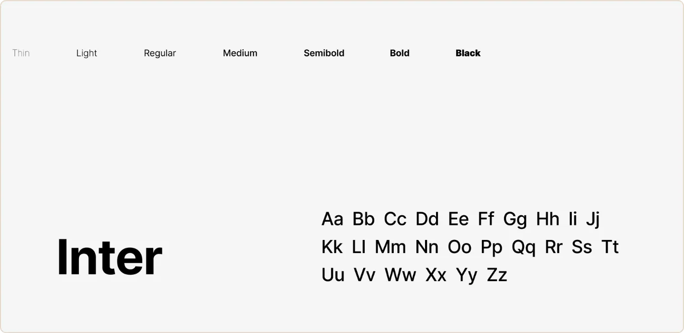
- Typography built for scanning, since most of what Dockit’s users read is numbers, dates, and merchant names not prose.
- A tone of voice that’s plain and reassuring: no “delight,” no forced personality. The product’s job is to be believed, not to entertain.

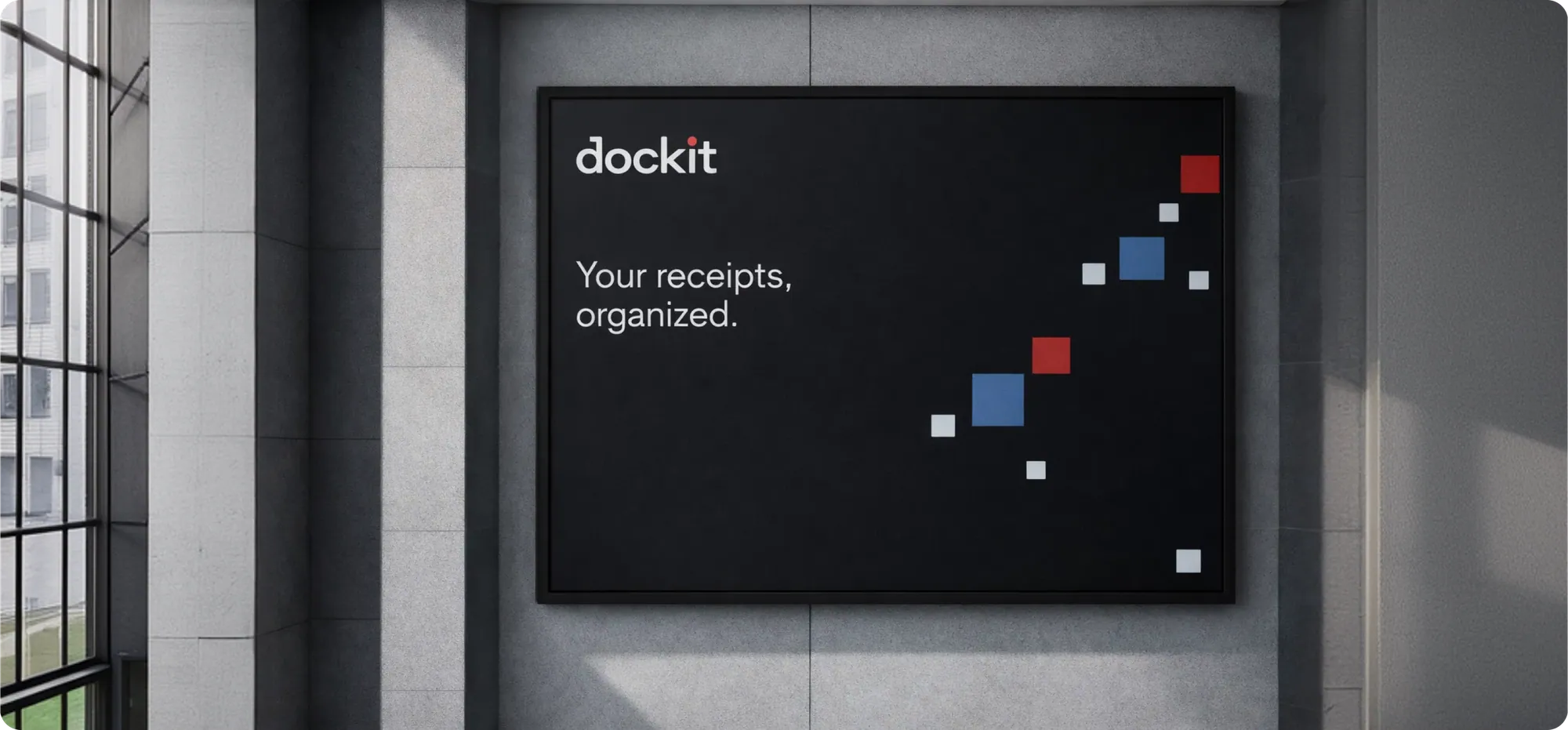
Where the Brand Shows Up
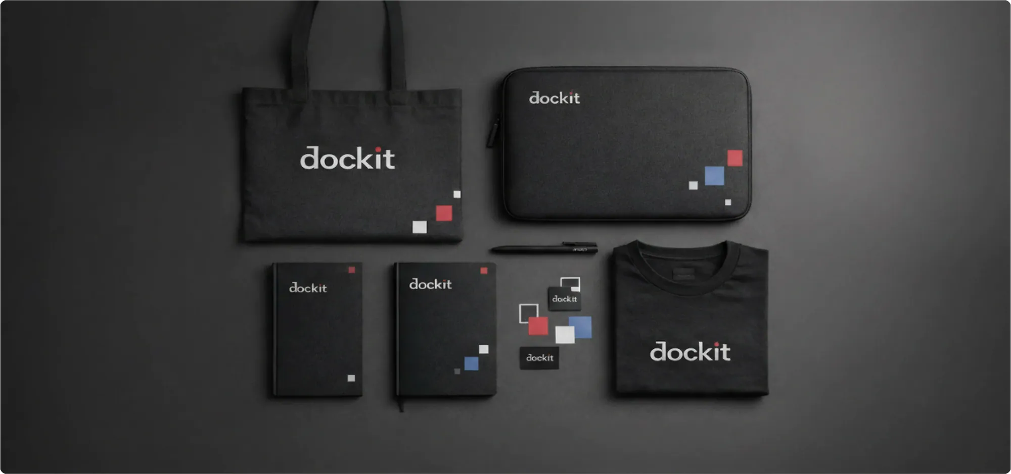
Branding only matters if it survives contact with real screens, so I carried the identity through every touchpoint:
- Consumer mobile app the MVP experience where the brand needed to feel fast, trustworthy, and unobtrusive.
- Merchant admin console a denser, more functional expression of the same system, built for retailers managing receipts at scale.
- Marketing website the front door, translating the brand into a story for both consumers and merchant prospects.
- App-store listings icon, screenshots, and copy tuned for a few seconds of attention.
- Design-system documentation so the brand didn’t live only in my head, but became something the engineering team could build against independently.